
When a Social Media Scheduling Tool Creates More Work Than It Saves
Software is supposed to make life better—not add more friction to tasks that should be simple.
After Elon Musk purchased Twitter, transformed it into X, and disrupted many of the third-party tools people relied on to manage their accounts, I began searching for an alternative. Like many users, I eventually migrated much of my activity to Bluesky.
Unfortunately, Bluesky lacked several features I depended on. The biggest was post scheduling—a feature it still does not natively support as of this writing.
For me, scheduling is not merely convenient. It is an essential part of promoting the articles I publish on dotNetTips.com.
My workflow on Twitter was straightforward. Whenever I published a new article, I scheduled promotional posts to run every three months for one year. At the end of that year, I evaluated whether the article was still relevant. If it was, I scheduled another year of posts.
Without scheduling support on Bluesky, I began creating Outlook calendar reminders so I could publish those posts manually. That approach quickly became unmanageable, especially because I typically publish the same content on Bluesky, Twitter, Facebook, and LinkedIn.
I needed a better solution.
That search led me to Buffer.
Buffer’s free plan allows users to connect three social media channels and schedule a limited number of posts. I began using it to determine whether the service could meet my needs before committing to a paid subscription.
I am still using the free plan—not because it fully meets my needs, but because I have been waiting for the user experience to improve.
Instead, it has gotten worse.
I have contacted Buffer through its support channels and posted feedback to its social media account, but I have seen little meaningful improvement. Since those efforts have gone nowhere, I decided to document the problems here.
I am evaluating Buffer not only as a customer, but also as a software engineer with decades of experience designing, reviewing, and improving software.
Unfortunately, Buffer contains far too many examples of user experience moving backward.
Creating a Post Should Be Simple
Buffer places a New button on the left side of the interface for creating a post.

When I open the post composer, the avatars for my Twitter and Bluesky accounts appear as generic placeholder images. This suggests that Buffer is either failing to retrieve the images or failing to render them properly.
That might seem like a small cosmetic issue, but profile images help users quickly confirm which accounts they have selected. When more accounts are connected, recognizable avatars become even more important.
The channel-selection workflow has also become less efficient.
Previously, if I deselected Facebook while creating a post, Buffer remembered that choice the next time I opened the composer. That was useful and predictable behavior.

It no longer works consistently.
The selection process has also become more cumbersome. Instead of simply clicking a channel’s image to deselect it, I must now hover over the image and click a tiny X.
That is not an improvement.
It replaces a large, obvious interaction target with a much smaller one and adds another step to a task users perform repeatedly. This is a textbook example of increasing friction without providing any clear benefit.
Today, this is only a minor annoyance because I have three channels connected. However, it would become a significant problem if I upgraded my account and added more Twitter and Bluesky profiles.
My friend and UX expert Mark Miller would likely have plenty to say about this design decision.
Catch Character Limits Before They Become a Problem
Buffer should evaluate a post against the character limit of the most restrictive selected platform while the user is composing it.

It does not.
Users should not have to proceed to another screen before learning that their post is too long for one or more networks. Buffer already knows which channels have been selected and what their character limits are. It should use that information immediately.
A simple option could allow users to compose against the shortest character limit among the selected networks. Buffer could then display a warning—or a live counter—before the user moves to the customization stage.
Not every customer would need this behavior, so it could be controlled through a checkbox or account preference.
For users like me who frequently publish the same message across multiple platforms, this feature would eliminate unnecessary editing and dramatically improve the workflow.
Scheduling Should Reduce Work, Not Add It
Scheduling is the primary reason I use Buffer, yet its scheduling interface creates some of the most frustrating problems.
Twitter’s scheduling interface provides a good example of how this process should work.
When scheduling a post, Twitter defaults the time to one hour in the future. When the user opens the time selector, the proposed time is already selected, making it easy to adjust.
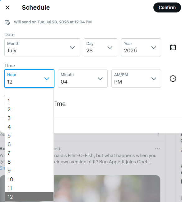
Buffer behaves very differently.

When I schedule a post, Buffer proposes two hours and forty minutes in the future. I cannot determine why that particular interval was selected.
When I open Buffer’s time selector, the proposed time is not highlighted or positioned conveniently. Instead, I must scroll through the list to find the time I want.
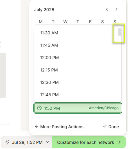
Even worse, the tiny gray scrollbar does not work correctly. Clicking it can close the scheduling window instead of scrolling through the available times. If that is not a scrollbar, they need to change it.
The interface should not fight the user during one of the product’s core workflows.
At a minimum, Buffer should highlight the proposed time and scroll directly to it. A better solution would allow each user to define a preferred scheduling offset, such as:
“Default new posts to one hour from now.”
That setting would make the experience faster, more predictable, and adaptable to different workflows.
Customizing Posts Without Clear Guidance
The next stage of Buffer’s workflow is Customize for Each Network.
If one or more posts exceed a platform’s character limit, the Schedule Posts button becomes disabled. However, Buffer does not immediately make it clear which channels are preventing the post from being scheduled.
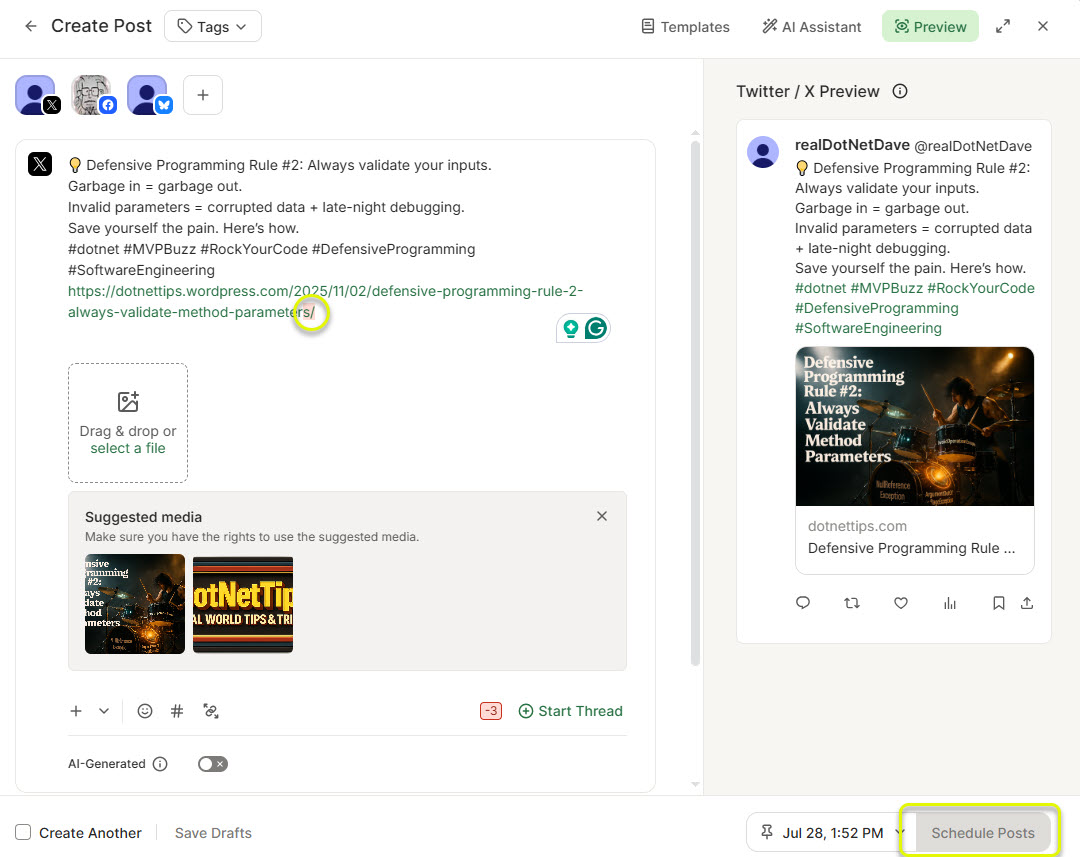
With only three connected channels, I can eventually determine which version needs to be changed. With six, ten, or twenty channels, this would become considerably more frustrating.
Buffer does highlight the text that exceeds the limit and shows how many characters must be removed. That information is useful.
The problem is that it appears too late.
This validation should happen during the initial composition stage—not after the user has already advanced to another step. Buffer is detecting the problem, but it is detecting it at the least convenient point in the workflow.
Good user experience is not just about providing information. It is about providing the right information at the right time.
Mentions and Hashtags Require Too Much Guesswork
Buffer also does not provide enough assistance when entering mentions or hashtags.
When users type an @ mention or a # hashtag, Buffer should display relevant suggestions from the selected platform whenever that platform’s integration supports it.

Instead, I frequently have to open each social media site, begin creating a fake post, search for the correct account or hashtag, copy the information, and then return to Buffer.
That defeats the purpose of using a centralized social media management tool.
It wastes enough time that I often abandon platform-specific mentions and hashtags entirely.
A scheduling platform should reduce the need to visit each individual network. Every time Buffer forces users to leave the application to complete a basic publishing task, it weakens its own value proposition.
The Vanishing “Send Another” Button
After I select Schedule Posts, Buffer sends the posts to its system.
The performance during this step is not particularly good. There is often a noticeable delay before the scheduling process is completed.
Once the posts have been scheduled, a Send Another button briefly appears near the top center of the page.
The word “briefly” is important.
The button disappears so quickly that I cannot switch to Outlook, copy the next post I want to schedule, and return to Buffer before it is gone.
The display duration should be significantly longer. Better yet, it should remain visible until the user dismisses it or navigates elsewhere.
Buffer could also make the duration configurable, although a persistent button would be the simpler and more predictable design.
The Send Another option is useful because it remembers which channels were selected for the previous post. That saves time when scheduling several similar posts.
This behavior once worked when selecting New Post from the main interface, but it was either removed or broken long ago.
Buffer already has a useful workflow. It simply makes that workflow unnecessarily difficult to access.
What Buffer Gets Right
The other Buffer feature I regularly use is its publishing calendar, which displays posts that have already been sent and those that are scheduled.

I do not have any major complaints about the calendar. It provides a useful overview of upcoming content and makes it relatively easy to confirm that posts have been scheduled.
Buffer also offers features for capturing and developing content ideas, but I have not used those features enough to evaluate them fairly.
The calendar proves that Buffer is capable of creating a clear and useful experience. Unfortunately, that level of usability is not consistent throughout the rest of the product.
Stability and Platform Failures
Buffer experiences periodic stability issues that prevent users from sending or scheduling posts. To be fair, outages and service interruptions affect every online platform.
However, Buffer’s behavior when an individual social network is unavailable raises a larger architectural and user experience concern.
Recently, Bluesky was unavailable for much of the morning. Because Bluesky was one of the selected channels, Buffer could not complete the overall publishing workflow.
Why should a problem with one platform prevent posts from being scheduled for every other available platform?
Buffer should accept and store the post, deliver it to the available channels, and retry the unavailable channel when service is restored. The user should receive a clear status message explaining what succeeded, what failed, and what Buffer will retry.
From the user’s perspective, clicking Schedule should complete the task. Temporary failures should be managed by the platform rather than pushed back onto the customer.
The current delay also makes me wonder whether Buffer processes each channel sequentially. If so, adding more accounts could make the experience progressively slower.
A more resilient approach would place each outgoing post into a queue and process each channel independently through background services. Buffer appears to use AWS infrastructure, which offers several mature technologies for implementing this type of architecture.
Regardless of the specific technology, one principle matters most: a failure involving one destination should not block every other destination.
A Recurring Scheduling Feature Could Set Buffer Apart
Buffer has an opportunity to offer a scheduling feature that would immediately make the service more valuable to customers like me.
As I explained earlier, I promote new dotNetTips.com articles every three months for one year. After that year, I review the article and decide whether it should continue being promoted.
Buffer should allow users to create recurring social media schedules similar to recurring calendar appointments.
For example:
“Post this message at 10:00 a.m. beginning Monday, July 27, repeat every three months, and stop after one year.”
This would save me a significant amount of time and eliminate the need to create multiple copies of the same scheduled post manually.
Buffer could support several recurrence options, including weekly, monthly, quarterly, yearly, a specific number of occurrences, or a defined ending date.
I have never seen this type of recurring publishing functionality in a social media management tool. Implemented properly, it could help Buffer distinguish itself from its competitors instead of merely matching them.
Final Verdict: Buffer Still Creates Too Much Friction
Buffer currently asks for more than $180 per year for the plan I would need. Before I commit that much money annually, I need confidence that the service will save me time and make managing multiple social media accounts easier.
Right now, I do not have that confidence.
The problems described in this article are not merely visual preferences. They affect discoverability, efficiency, reliability, accessibility, and the number of steps required to complete common tasks.
Individually, some of these issues might appear minor. Together, they create a workflow filled with unnecessary friction:
The product forgets channel selections, replaces easy interactions with smaller targets, delays character-limit warnings, makes time selection cumbersome, provides inadequate guidance when posts fail validation, offers little help with mentions and hashtags, hides useful actions too quickly, and allows one unavailable network to disrupt the entire publishing process.
That is not the experience a social media management platform should provide.
Buffer’s fundamental concept remains useful. I continue using it because it partially solves a real problem. However, I am reaching the point where the time lost working around its interface may outweigh the time it saves.
Since I am no longer expecting meaningful improvements anytime soon, I will begin evaluating alternatives. A Microsoft employee I know has developed one service that is next on my list.
User experience is critical to the success of every product and service. It determines whether customers merely tolerate a product or become loyal advocates for it.
Companies do not need to reinvent every interaction. They should study the products that came before them, identify the workflows users already understand, preserve the parts that work, and improve the parts that do not.
Too many companies change interfaces simply to make them different. Different is not automatically better.
Better is faster, clearer, more predictable, and less frustrating.
Buffer still has an opportunity to become that kind of product—but first, it needs to stop adding friction to the very tasks it promises to simplify.
A Note to Buffer
If Buffer needs help improving its user experience, I am available on a contract basis.
Reach out, and let’s make Buffer better.
Pick up any books by David McCarter by going to Amazon.com: http://bit.ly/RockYourCodeBooks
Make a one-time donation
Make a monthly donation
Make a yearly donation
Choose an amount
Or enter a custom amount
Your contribution is appreciated.
Your contribution is appreciated.
Your contribution is appreciated.
If you liked this article, please buy David a cup of Coffee by going here: https://www.buymeacoffee.com/dotnetdave
© The information in this article is copywritten and cannot be reproduced in any way without express permission from David McCarter.
Discover more from dotNetTips.com
Subscribe to get the latest posts sent to your email.
