For all of you who code using apps like Visual Studio or VS Code, please do not present code in a meeting or conference session using a dark theme! I know I am going to get a lot of pushback from this statement, but let me explain why (please keep reading).
Living with Colorblindness
I really do not want to publicize this to the world, but I am color blind. Yes, I do see colors, but I see them differently than most of you. On top of that, I have the worst kind, which affects colors that include red or green. These colors appear much less distinct to me than they do to others.
I first discovered something was off when I was in elementary school. Our teacher, Mr. Winslow, showed the class a colored map. Later, when I asked him a question about the map, he pointed out something I could not see—the difference between two areas of the map that were only distinguished by shades of the same color.
Later, in middle school, our science teacher presented a color blindness graphic similar to the one shown here.
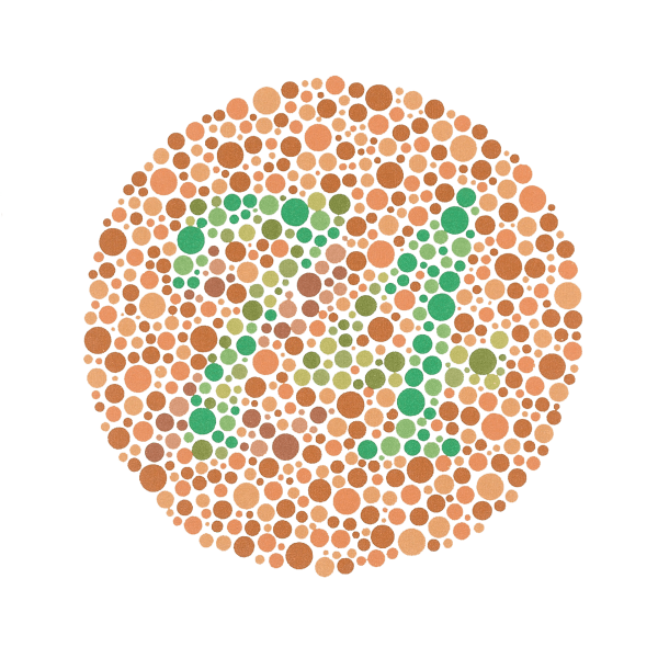
Can you see a number or letter in this graphic? I cannot; all I see is a bunch of random colored dots. Sadly, the teacher decided to make fun of me, and the rest of the class joined in. Since then, I have rarely mentioned my color blindness.
When I turned 19, I joined the United States Navy. I wanted to be a photographer but could not. Then I wanted to be an electrician but could not. Eventually, I thought I could serve on a submarine, but I could not do that either, because of my color blindness. This was the moment I realized that being color blind was a handicap, and I had to find ways to work around it. Later, I learned that in the United States, color blindness is legally considered a handicap.
Like any handicap, I found ways to navigate the world. I am now an award-winning photographer, working for many well-known rock bands. Despite my success, I still struggle with matching clothes, which is why I dress plainly or rely on someone else—like my daughter or a store clerk—for help.
Color Blindness Stats
Ok, enough about me. Color blindness predominantly affects men, and the prevalence can vary depending on the country you live in. Studies show that up to 10% of a population can be color blind.
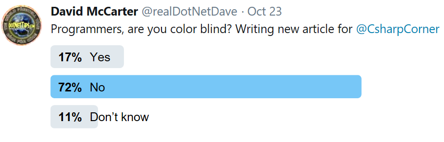
In fact, I decided to conduct a Twitter poll to see how many developers share my condition. The results were enlightening—developers are nearly twice as likely to be color blind. So how does this affect technology? Quite a lot. It makes it harder to use apps like Google Maps when checking traffic speeds or to navigate the new dark themes in programs like Visual Studio. If you love your dark-themed apps, do not worry—I’m not asking you to stop using them. But I do urge you to consider this when presenting your code in company meetings or conferences. I have sat next to developers using a dark theme, and I can barely make out the code at all. Yes, it is that challenging for me.
It’s All About Contrast
The challenge with dark themes boils down to one thing: contrast. Dark text on a white background stands out and can be easily read by everyone, even when the text is colored, as shown here.
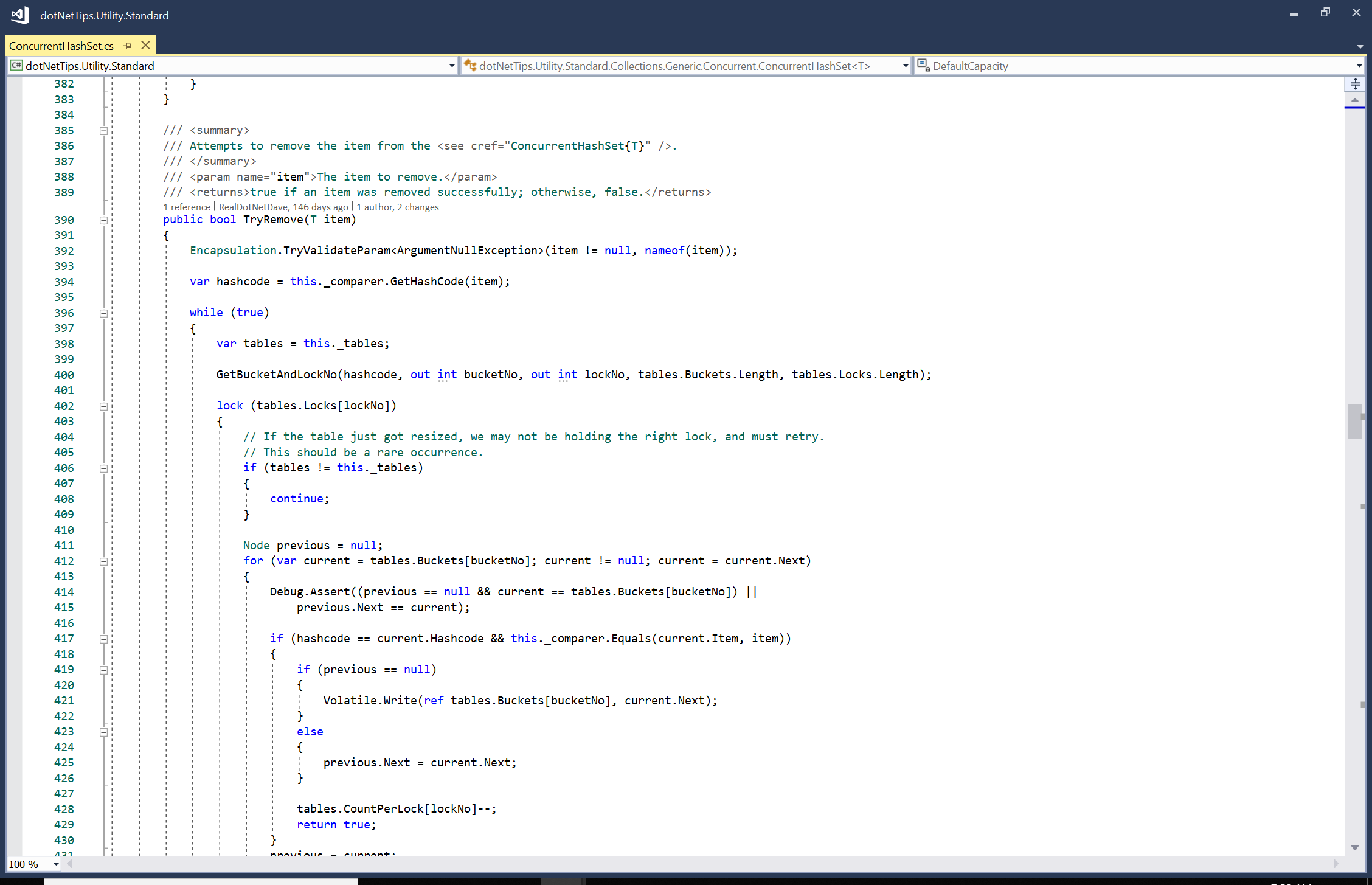
This example uses the light theme in Visual Studio, along with the default font size. Now, compare this to how the same screen looks in a dark theme:
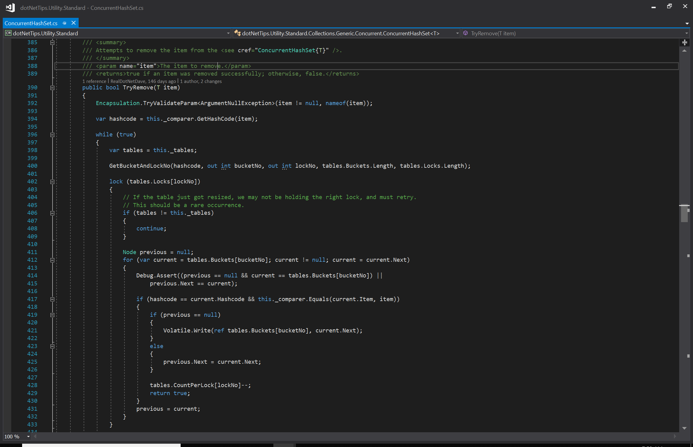
In a dark theme, the text becomes hard to read because it does not “pop.” The dark background around the colored text makes it almost impossible to decipher. For me, even the white text is difficult to read. It would be easier if the font size were larger, but most presenters do not adjust the font size when they present. I always use a minimum font size of 14 points, not the default 10 in Visual Studio.
If you have seen me speak live, you know that I use a dark theme for my PowerPoint slides, which complements my “Rock Your Code” brand. But I also use large font sizes when displaying code.

As shown in this slide, the text and code are easy to read, even from a distance, because the text is large (32 points) and the code is 20 points.
Application Development And Accessibility
For a long time, I have been urging companies I work for to consider their color-blind users when choosing colors and icons. I am not sure that they fully realize how this could affect thousands—or even millions—of users. This is not a small group of people.
Microsoft provides valuable resources for making apps more accessible, such as their Accessibility Best Practices post. If you are involved in the user experience (UX) aspect of app development, I highly recommend reading this post, along with others, before releasing an app!
I also reached out to my friend Mark Miller, a longtime colleague and speaker at my user group, who has extensive experience in UI/UX. He pointed out that “Positive polarity (black text on a white background) is better than negative polarity, as supported by evidence in my Science of Great UI course (sgui.com).”
Summary
If you are presenting code, please use the theme with a white background, and increase your font size to a minimum of 14, ideally 16 points. This way, I do not have to leave the room or start checking my cellphone just to follow along when code is presented.
I hope you will consider making this adjustment for the sake of all your color-blind peers. And please, leave a comment below—let us discuss how we can make coding and presentations more accessible for everyone.
Pick up any books by David McCarter by going to Amazon.com: http://bit.ly/RockYourCodeBooks
Make a one-time donation
Make a monthly donation
Make a yearly donation
Choose an amount
Or enter a custom amount
Your contribution is appreciated.
Your contribution is appreciated.
Your contribution is appreciated.
DonateDonate monthlyDonate yearlyIf you liked this article, please buy David a cup of Coffee by going here: https://www.buymeacoffee.com/dotnetdave
© The information in this article is copywritten and cannot be preproduced in any way without express permission from David McCarter.
Discover more from dotNetTips.com
Subscribe to get the latest posts sent to your email.

I have been teaching programming since the mid-80s, first on a blackboard and later using a whiteboard. I draw 3D diagrams on the board to explain the internals of technology and I started using colour whiteboard markers. Once, after a session of multi-dimension pointers and arrays in C, I stepped out of the session and a student rushed out after me and asked me to explain it again. A bit irritated told him, whatever is drawn in red is a pointer and what is drawn in blue is a value. He looked at me, smiled and said “I am colour blind. I can only see shades of gray”. I was taken aback and for the first time, I realized about colour blindness. I still use colours to differentiate between different parts of the diagram but I make sure that colour is not the ONLY differentiator.
You can see some of these diagrams on youtube.com/DigitalCV.